This will actually be a short one. Part 3 will be on improving sleep. I ran across these two graphs today and thought that the comparison is worth remarking on.
Map of Sleep Insufficiency:
The map below depicts age-adjusted* percentage of adults who reported 30 days of insufficient rest or sleep† during the preceding 30 days. Data is from the 2008 Behavioral Risk Factor Surveillance System, United States.‡
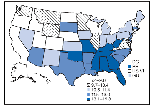
Source: http://www.cdc.gov/sleep/data_statistics.htm
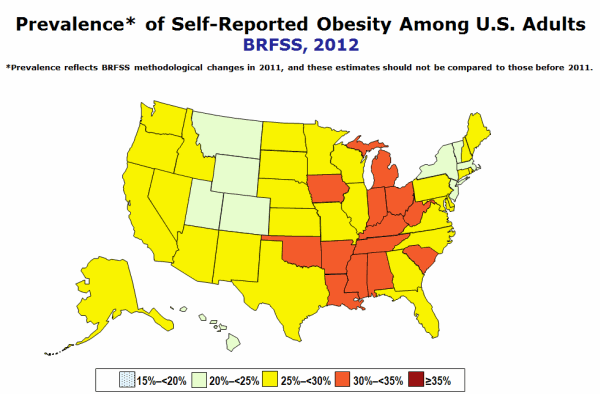
Certainly this is not scientific. I haven’t calculated the p value of correlation, but notice anything on these two maps? These are maps of self reported sleep deprivation (darker blue is more sleep deprivation) and self reported obesity (red is higher rate). It’s not 1 to 1 perhaps, a few states buck the correlation, but the similarity of distribution seems obvious.

I notice a weather correlation. Where it’s nice, people sleep better. Where it’s cold, it’s a little harder to sleep, and where it’s hot and humid, it’s very hard to sleep. Where the air is fresh, people have healthy habits. Where it’s muggy, they don’t.